Android에서 모서리가 둥근 사용자 지정 대화 상자를 만드는 방법
내가 하려는 일: 모서리가 둥근 안드로이드에서 사용자 지정 대화상자를 만들려고 합니다.
무슨 일이 일어나고 있는지:맞춤 대화는 가능하지만 모서리가 둥글지 않습니다.셀렉터를 추가해 보았지만 모서리가 둥글지 않았습니다.
아래는 같은 것에 대한 나의 코드입니다.
Java 코드:
private void launchDismissDlg() {

        dialog = new Dialog(getActivity(), android.R.style.Theme_Dialog);
        dialog.requestWindowFeature(Window.FEATURE_NO_TITLE);
        dialog.setContentView(R.layout.dlg_dismiss);
        dialog.setCanceledOnTouchOutside(true);

        Button btnReopenId = (Button) dialog.findViewById(R.id.btnReopenId);
        Button btnCancelId = (Button) dialog.findViewById(R.id.btnCancelId);

        btnReopenId.setOnClickListener(new OnClickListener() {
            @Override
            public void onClick(View v) {


            }
        });


        btnCancelId.setOnClickListener(new OnClickListener() {
            @Override
            public void onClick(View v) {


            }
        });
        dialog.setCanceledOnTouchOutside(false);
        dialog.getWindow().setSoftInputMode(WindowManager.LayoutParams.SOFT_INPUT_STATE_ALWAYS_HIDDEN);
        dialog.getWindow().setLayout(LayoutParams.MATCH_PARENT,LayoutParams.WRAP_CONTENT);
        dialog.show();

    }
xml 코드:
<?xml version="1.0" encoding="utf-8"?>
<LinearLayout xmlns:android="http://schemas.android.com/apk/res/android"
android:layout_width="match_parent"
android:layout_height="match_parent"
android:background="@android:color/white"
android:orientation="vertical" >
<TableLayout
android:layout_width="match_parent"
android:layout_height="wrap_content" >
<TableRow
android:id="@+id/tableRow1"
android:layout_width="match_parent"
android:layout_height="wrap_content"
android:layout_marginTop="20dp"
android:gravity="center" >
<TextView
android:id="@+id/textView1"
android:layout_width="wrap_content"
android:layout_height="wrap_content"
android:gravity="center"
android:text=""I WOULD LIKE TO DISMISS THE VENDOR""
android:textColor="@color/col_dlg_blue_light"
android:textSize="14sp"
android:textStyle="bold" />
</TableRow>
<TableRow
android:id="@+id/tableRow2"
android:layout_width="match_parent"
android:layout_height="wrap_content"
android:layout_marginTop="5dp"
android:gravity="center" >
<TextView
android:id="@+id/textView2"
android:layout_width="wrap_content"
android:layout_height="wrap_content"
android:gravity="center"
android:text="BECAUSE"
android:textColor="@android:color/black"
android:textStyle="bold" />
</TableRow>
<TableRow
android:id="@+id/tableRow4"
android:layout_width="match_parent"
android:layout_height="wrap_content" >
<Button
android:id="@+id/btnReopenId"
android:layout_width="0dp"
android:layout_height="wrap_content"
android:layout_weight="1"
android:background="@color/col_dlg_green_light"
android:text="REOPEN"
android:padding="5dp"
android:textSize="14sp"
android:textColor="@android:color/white"
android:textStyle="bold" />
<Button
android:id="@+id/btnCancelId"
android:layout_width="0dp"
android:layout_height="wrap_content"
android:layout_weight="1"
android:background="@color/col_dlg_pink_light"
android:text="CANCEL"
android:padding="5dp"
android:textSize="14sp"
android:textColor="@android:color/white"
android:textStyle="bold" />
</TableRow>
</TableLayout>
</LinearLayout>
수 있는. 예를 들어 XML 파일을 만듭니다.dialog_bg.xml:
<?xml version="1.0" encoding="utf-8"?>
<shape xmlns:android="http://schemas.android.com/apk/res/android">
    <solid
        android:color="@color/white"/>
    <corners
        android:radius="30dp" />
    <padding
        android:left="10dp"
        android:top="10dp"
        android:right="10dp"
        android:bottom="10dp" />
</shape>
레이아웃 XML의 배경으로 설정합니다.
android:background="@drawable/dialog_bg"
Android는 사용자 정의 레이아웃의 모서리를 숨기는 루트 뷰 내에 대화상자의 루트 뷰의 배경을 투명하게 설정합니다.
Java:
dialog.getWindow().setBackgroundDrawable(new ColorDrawable(Color.TRANSPARENT));
코틀린:
dialog.window?.setBackgroundDrawable(ColorDrawable(Color.TRANSPARENT))
Androidx 라이브러리 및 Material Components Theme을 사용하면 다음 방법을 재정의할 수 있습니다.
import androidx.fragment.app.DialogFragment

class RoundedDialog: DialogFragment() {

    override fun getTheme() = R.style.RoundedCornersDialog

    //....

}
다음 항목 포함:
<style name="RoundedCornersDialog" parent="@style/Theme.MaterialComponents.Dialog">
    <item name="dialogCornerRadius">16dp</item>
</style>
또는 Material Components Library에 포함된 를 사용할 수 있습니다.
import androidx.fragment.app.DialogFragment
import com.google.android.material.dialog.MaterialAlertDialogBuilder
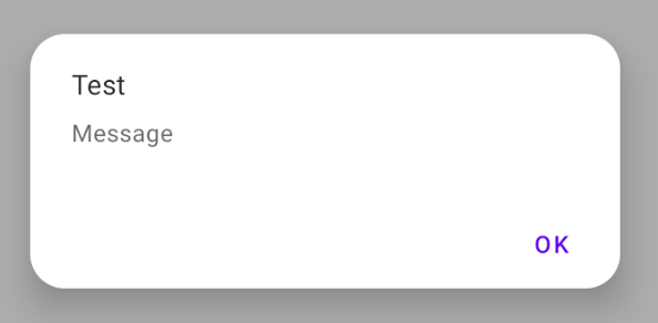
class RoundedAlertDialog : DialogFragment() {
//...
override fun onCreateDialog(savedInstanceState: Bundle?): Dialog {
return MaterialAlertDialogBuilder(requireActivity(), R.style.MaterialAlertDialog_rounded)
.setTitle("Test")
.setMessage("Message")
.setPositiveButton("OK", null)
.create()
}
}
다음 항목 포함:
<style name="MaterialAlertDialog_rounded" parent="@style/ThemeOverlay.MaterialComponents.MaterialAlertDialog">
    <item name="shapeAppearanceOverlay">@style/DialogCorners</item>
</style>

<style name="DialogCorners">
    <item name="cornerFamily">rounded</item>
    <item name="cornerSize">16dp</item>
</style>
,DialogFragment그냥 을 사용합니다.
다음 작업을 수행해야 합니다.
대화상자의 배경에 대해 모서리가 둥근 배경을 만듭니다.
<?xml version="1.0" encoding="utf-8"?>
<shape xmlns:android="http://schemas.android.com/apk/res/android"
android:shape="rectangle" >

    <solid android:color="#fff" />

    <corners
        android:bottomLeftRadius="8dp"
        android:bottomRightRadius="8dp"
        android:topLeftRadius="8dp"
        android:topRightRadius="8dp" />

</shape>
이제 루트 레이아웃의 Dialog의 XML 파일에서 필요한 여백과 함께 이 배경을 사용합니다.
android:layout_marginLeft="20dip"
android:layout_marginRight="20dip"
android:background="@drawable/dialog_background"
마지막으로 자바 부분에서 다음을 수행해야 합니다.
dialog.requestWindowFeature(Window.FEATURE_NO_TITLE);
dialog.setContentView(layoutResId);
View v = getWindow().getDecorView();
v.setBackgroundResource(android.R.color.transparent);
이것은 저에게 딱 들어맞습니다.
dialog.getWindow().setBackgroundDrawable(new ColorDrawable(Color.TRANSPARENT));
이것은 나에게 알맞습니다.
세팅
dialog.getWindow().setBackgroundDrawable(new ColorDrawable(Color.TRANSPARENT));
그림자를 드리우는 대화를 차단합니다.
해결책은 사용하는 것입니다.
dialog.getWindow().setBackgroundDrawableResource(R.drawable.dialog_rounded_background);
여기서 는 R.drawable.dialog_rounded_background 입니다.
<?xml version="1.0" encoding="utf-8"?>
<layer-list xmlns:android="http://schemas.android.com/apk/res/android" >
    <item>
        <shape android:shape="rectangle" android:padding="10dp">
            <solid
                android:color="@color/dialog_bg_color"/>
            <corners
                android:radius="30dp" />
        </shape>
    </item>

</layer-list>
재료 구성요소를 사용하는 경우:
CustomDialog.kt
class CustomDialog: DialogFragment() {

    override fun getTheme() = R.style.RoundedCornersDialog

}
styles.xml
<style name="RoundedCornersDialog" parent="Theme.MaterialComponents.Dialog">
    <item name="dialogCornerRadius">dimen</item>
</style>
dimen.xml
<?xml version="1.0" encoding="utf-8"?>
<resources>

    <integer name="weight">1</integer>

    <dimen name="dialog_top_radius">21dp</dimen>

    <dimen name="textview_dialog_head_min_height">50dp</dimen>
    <dimen name="textview_dialog_drawable_padding">5dp</dimen>

    <dimen name="button_dialog_layout_margin">3dp</dimen>


</resources>
styles.xml
<style name="TextView.Dialog">
        <item name="android:paddingLeft">@dimen/dimen_size</item>
        <item name="android:paddingRight">@dimen/dimen_size</item>
        <item name="android:gravity">center_vertical</item>
        <item name="android:textColor">@color/black</item>
    </style>

    <style name="TextView.Dialog.Head">
        <item name="android:minHeight">@dimen/textview_dialog_head_min_height</item>
        <item name="android:textColor">@color/white</item>
        <item name="android:background">@drawable/dialog_title_style</item>
        <item name="android:drawablePadding">@dimen/textview_dialog_drawable_padding</item>
    </style>

    <style name="TextView.Dialog.Text">
        <item name="android:textAppearance">@style/Font.Medium.16</item>
    </style>

    <style name="Button" parent="Base.Widget.AppCompat.Button">
        <item name="android:layout_height">@dimen/button_min_height</item>
        <item name="android:layout_width">match_parent</item>
        <item name="android:textColor">@color/white</item>
        <item name="android:gravity">center</item>
        <item name="android:textAppearance">@style/Font.Medium.20</item>
    </style>

 <style name="Button.Dialog">
        <item name="android:layout_weight">@integer/weight</item>
        <item name="android:layout_margin">@dimen/button_dialog_layout_margin</item>
    </style>

    <style name="Button.Dialog.Middle">
        <item name="android:background">@drawable/button_primary_selector</item>
    </style>
dialog_dialog_style.xml
<?xml version="1.0" encoding="utf-8"?>
<shape xmlns:android="http://schemas.android.com/apk/res/android"
    android:shape="rectangle">

    <gradient
        android:angle="270"
        android:endColor="@color/primaryDark"
        android:startColor="@color/primaryDark" />

    <corners
        android:topLeftRadius="@dimen/dialog_top_radius"
        android:topRightRadius="@dimen/dialog_top_radius" />

</shape>
dialog_background.xml
<?xml version="1.0" encoding="utf-8"?>
<shape xmlns:android="http://schemas.android.com/apk/res/android">
    <solid android:color="@color/backgroundDialog" />
    <corners
        android:topLeftRadius="@dimen/dialog_top_radius"
        android:topRightRadius="@dimen/dialog_top_radius" />
    <padding />
</shape>
dialog_one_button.xml
<?xml version="1.0" encoding="utf-8"?>
<LinearLayout xmlns:android="http://schemas.android.com/apk/res/android"
    android:layout_width="match_parent"
    android:layout_height="wrap_content"
    android:background="@drawable/dailog_background"
    android:orientation="vertical">

    <TextView
        android:id="@+id/dialogOneButtonTitle"
        style="@style/TextView.Dialog.Head"
        android:text="Process Completed" />

    <LinearLayout
        android:layout_width="match_parent"
        android:layout_height="wrap_content"
        android:layout_marginBottom="16dp"
        android:layout_marginLeft="16dp"
        android:layout_marginRight="16dp"
        android:orientation="vertical">

        <TextView
            android:id="@+id/dialogOneButtonText"
            style="@style/TextView.Dialog.Text"
            android:text="Return the main menu" />

        <LinearLayout
            android:layout_width="match_parent"
            android:layout_height="wrap_content"
            android:orientation="horizontal">

            <Button
                android:id="@+id/dialogOneButtonOkButton"
                style="@style/Button.Dialog.Middle"
                android:text="Ok" />

        </LinearLayout>

    </LinearLayout>

</LinearLayout>
OneButtonDialog.java
package com.example.sametoztoprak.concept.dialogs;

import android.app.Dialog;
import android.graphics.Color;
import android.graphics.drawable.ColorDrawable;
import android.os.Bundle;
import android.support.v7.app.AppCompatActivity;
import android.view.View;
import android.view.Window;
import android.widget.Button;
import android.widget.TextView;

import com.example.sametoztoprak.concept.R;
import com.example.sametoztoprak.concept.models.DialogFields;

/**
 * Created by sametoztoprak on 26/09/2017.
 */

public class OneButtonDialog extends Dialog implements View.OnClickListener {

    private static OneButtonDialog oneButtonDialog;
    private static DialogFields dialogFields;

    private Button dialogOneButtonOkButton;
    private TextView dialogOneButtonText;
    private TextView dialogOneButtonTitle;

    public OneButtonDialog(AppCompatActivity activity) {
        super(activity);
    }

    public static OneButtonDialog getInstance(AppCompatActivity activity, DialogFields dialogFields) {
        OneButtonDialog.dialogFields = dialogFields;
        return oneButtonDialog = (oneButtonDialog == null) ? new OneButtonDialog(activity) : oneButtonDialog;
    }

    @Override
    protected void onCreate(Bundle savedInstanceState) {
        super.onCreate(savedInstanceState);
        requestWindowFeature(Window.FEATURE_NO_TITLE);
        setContentView(R.layout.dialog_one_button);
        getWindow().setBackgroundDrawable(new ColorDrawable(Color.TRANSPARENT));

        dialogOneButtonTitle = (TextView) findViewById(R.id.dialogOneButtonTitle);
        dialogOneButtonText = (TextView) findViewById(R.id.dialogOneButtonText);
        dialogOneButtonOkButton = (Button) findViewById(R.id.dialogOneButtonOkButton);

        dialogOneButtonOkButton.setOnClickListener(this);
    }

    @Override
    protected void onStart() {
        super.onStart();
        dialogOneButtonTitle.setText(dialogFields.getTitle());
        dialogOneButtonText.setText(dialogFields.getText());
        dialogOneButtonOkButton.setText(dialogFields.getOneButton());
    }

    @Override
    public void onClick(View v) {
        switch (v.getId()) {
            case R.id.dialogOneButtonOkButton:

                break;
            default:
                break;
        }
        dismiss();
    }
}

저는 배경 그림이 없는 새로운 방법을 만들었습니다. 카드뷰를 모체로 만들어 주는 것입니다.app:cardCornerRadius="20dp" class바에을다e에 합니다.dialog.getWindow().setBackgroundDrawable(new ColorDrawable(Color.TRANSPARENT));
또 다른 방법입니다.
MaterialAlertDialogBuilder를 사용하여 모서리가 둥근 사용자 정의 대화상자를 만들 수 있습니다.
먼저 다음과 같이 재료 대화상자에 대한 스타일을 작성합니다.
<style name="MyRounded.MaterialComponents.MaterialAlertDialog" parent="@style/ThemeOverlay.MaterialComponents.MaterialAlertDialog">
    <item name="shapeAppearanceOverlay">@style/ShapeAppearanceOverlay.App.CustomDialog.Rounded
    </item>
    <item name="colorSurface">@color/YOUR_COLOR</item>
</style>

<style name="ShapeAppearanceOverlay.App.CustomDialog.Rounded" parent="">
    <item name="cornerFamily">rounded</item>
    <item name="cornerSize">10dp</item>
</style>
그런 다음 Java 클래스에 다음과 같은 Alert Dialog 개체를 만듭니다.
AlertDialog alertDialog =  new MaterialAlertDialogBuilder(this,R.style.MyRounded_MaterialComponents_MaterialAlertDialog)  // for fragment you can use getActivity() instead of this
                    .setView(R.layout.custom_layout) // custom layout is here
                    .show();

            final EditText editText = alertDialog.findViewById(R.id.custom_layout_text);   // access to text view of custom layout
            Button btn = alertDialog.findViewById(R.id.custom_layout_btn);

            btn.setOnClickListener(new View.OnClickListener() {
                @Override
                public void onClick(View v) {

                    Log.d(TAG, "onClick: " + editText.getText().toString());
                }
            });
당신이 할 일은 그것뿐입니다.
대화상자로 이동하기 위해 탐색 아키텍처 구성요소 작업을 사용하는 경우 XML로 작업을 수행하는 것을 좋아하는 모든 사용자에게 특히 유용합니다.
다음을 사용할 수 있습니다.
<style name="DialogStyle" parent="ThemeOverlay.MaterialComponents.Dialog.Alert">

    <!-- dialog_background is drawable shape with corner radius -->
    <item name="android:background">@drawable/dialog_background</item>

    <item name="android:windowBackground">@android:color/transparent</item>
</style>
가장 간단한 방법은 사용하는 것입니다.
CardView 및 그 카드:cardCornerRadius
<?xml version="1.0" encoding="utf-8"?>
<android.support.v7.widget.CardView
 xmlns:android="http://schemas.android.com/apk/res/android"
 xmlns:card="http://schemas.android.com/apk/res-auto"
 android:orientation="vertical"
 android:id="@+id/cardlist_item"
 android:layout_width="match_parent"
 android:layout_height="130dp"
 card:cardCornerRadius="40dp"
 android:layout_marginLeft="8dp"
 android:layout_marginRight="8dp"
 android:layout_marginTop="5dp"
 android:layout_marginBottom="5dp"
 android:background="@color/white">

  <RelativeLayout
    android:layout_width="match_parent"
    android:layout_height="match_parent"
    android:layout_margin="12sp"
    android:orientation="vertical"
    android:weightSum="1">
    </RelativeLayout>

</android.support.v7.widget.CardView>
대화상자를 작성할 때
dialog.getWindow().setBackgroundDrawable(new ColorDrawable(Color.TRANSPARENT));
배경에 대한 모양을 다음과 같이 사용할 수 있습니다.
<shape xmlns:android="http://schemas.android.com/apk/res/android"
    android:shape="rectangle">
    <solid android:color="@android:color/transparent"/>
    <corners android:radius="10dp" />
    <padding android:left="10dp" android:right="10dp"/>
</shape>
자세한 내용은 이것을 보세요.
API level >= 28 사용가능 속성android:dialogCornerRadius. 이전 API 버전을 지원하려면 다음을 사용해야 합니다.
<style name="RoundedDialog" parent="Theme.AppCompat.Light.Dialog.Alert">
        <item name="android:windowBackground">@drawable/dialog_bg</item>
    </style>
여기서 dialog_bg.xml
<?xml version="1.0" encoding="utf-8"?>
<layer-list xmlns:android="http://schemas.android.com/apk/res/android">
    <item >
        <shape >
            <solid android:color="@android:color/transparent" />
        </shape>
    </item>
    <item
        android:left="16dp"
        android:right="16dp">
        <shape>
            <solid
                android:color="@color/white"/>
            <corners
                android:radius="8dp" />

            <padding
                android:left="16dp"
                android:right="16dp" />
        </shape>
    </item>
</layer-list>
기본 솔루션은 다음과 같습니다.
 <style name="Style_Dialog_Rounded_Corner" parent="Theme.AppCompat.Light.Dialog.Alert">
        <item name="android:windowBackground">@drawable/dialog_rounded_corner</item>
        <item name="android:windowMinWidthMinor">85%</item>
    </style>
그리기 가능 작성 모양에서:
<?xml version="1.0" encoding="utf-8"?>
<shape xmlns:android="http://schemas.android.com/apk/res/android">
    <solid android:color="#FFFFFF" />
    <corners android:radius="12dp" />
</shape>
Builder Constructor의 패스 스타일
AlertDialog alert = new AlertDialog.Builder(MainActivity.this,R.style.Style_Dialog_Rounded_Corner).create();
대화상자의 모서리 반지름을 제어하고 입면 그림자를 보존하려면 다음과 같이 하십시오.
대화상자:
class OptionsDialog: DialogFragment() {

override fun onCreateView(inflater: LayoutInflater, container: ViewGroup, savedInstanceState: Bundle?): View {
    dialog?.window?.setBackgroundDrawable(ColorDrawable(Color.TRANSPARENT))
    return inflater.inflate(R.layout.dialog_options, container)
}

}
dialog_dialog.xml 레이아웃:
<FrameLayout xmlns:android="http://schemas.android.com/apk/res/android"
xmlns:app="http://schemas.android.com/apk/res-auto"
android:layout_width="wrap_content"
android:layout_height="wrap_content">

<androidx.cardview.widget.CardView
    android:layout_width="wrap_content"
    android:layout_height="wrap_content"
    android:layout_margin="40dp"
    app:cardElevation="20dp"
    app:cardCornerRadius="12dp">

    <androidx.constraintlayout.widget.ConstraintLayout
        id="@+id/actual_content_goes_here"
        android:layout_width="wrap_content"
        android:layout_height="wrap_content">
    </androidx.constraintlayout.widget.ConstraintLayout>

</androidx.cardview.widget.CardView>
</FrameLayout>
핵심은 카드 뷰를 다른 뷰 그룹(여기서는 FrameLayout)으로 래핑하고 여백을 설정하여 입면 그림자 공간을 만드는 것입니다.
코틀린에서는 DoubleButtonDialog 클래스를 사용하고 있습니다.줄이 있는 Javawindow?.setBackgroundDrawable(ColorDrawable(Color.TRANSPARENT))중요한 것으로서
class DoubleButtonDialog(context: Context) : Dialog(context, R.style.DialogTheme) {

    private var cancelableDialog: Boolean = true
    private var titleDialog: String? = null
    private var messageDialog: String? = null
    private var leftButtonDialog: String = "Yes"
    //    private var rightButtonDialog: String? = null
    private var onClickListenerDialog: OnClickListener? = null

    override fun onCreate(savedInstanceState: Bundle?) {
        window?.setBackgroundDrawable(ColorDrawable(Color.TRANSPARENT))
        //requestWindowFeature(android.view.Window.FEATURE_NO_TITLE)
        setCancelable(cancelableDialog)
        setContentView(R.layout.dialog_double_button)
//        val btnNegative = findViewById<Button>(R.id.btnNegative)
//        btnNegative.visibility = View.GONE
//        if (rightButtonDialog != null) {
//            btnNegative.visibility = View.VISIBLE
//            btnNegative.text = rightButtonDialog
//            btnNegative.setOnClickListener {
//                dismiss()
//                onClickListenerDialog?.onClickCancel()
//            }
//        }
        val btnPositive = findViewById<Button>(R.id.btnPositive)
        btnPositive.text = leftButtonDialog
        btnPositive.setOnClickListener {
            onClickListenerDialog?.onClick()
            dismiss()
        }
        (findViewById<TextView>(R.id.title)).text = titleDialog
        (findViewById<TextView>(R.id.message)).text = messageDialog
        super.onCreate(savedInstanceState)
    }

    constructor(
        context: Context, cancelableDialog: Boolean, titleDialog: String?,
        messageDialog: String, leftButtonDialog: String, /*rightButtonDialog: String?,*/
        onClickListenerDialog: OnClickListener
    ) : this(context) {
        this.cancelableDialog = cancelableDialog
        this.titleDialog = titleDialog
        this.messageDialog = messageDialog
        this.leftButtonDialog = leftButtonDialog
//        this.rightButtonDialog = rightButtonDialog
        this.onClickListenerDialog = onClickListenerDialog
    }
}


interface OnClickListener {
    //    fun onClickCancel()
    fun onClick()
}
레이아웃에서 dialog_double_button.xml을 만들 수 있습니다.
    <?xml version="1.0" encoding="utf-8"?>
    <LinearLayout xmlns:android="http://schemas.android.com/apk/res/android"
        xmlns:tools="http://schemas.android.com/tools"
        android:layout_width="fill_parent"
        android:layout_height="wrap_content"
        android:layout_gravity="center"
        android:layout_margin="@dimen/dimen_10"
        android:background="@drawable/bg_double_button"
        android:orientation="vertical"
        android:padding="@dimen/dimen_5">

        <TextView
            android:id="@+id/title"
            style="@style/TextViewStyle"
            android:layout_gravity="center_horizontal"
            android:layout_margin="@dimen/dimen_10"
            android:fontFamily="@font/campton_semi_bold"
            android:textColor="@color/red_dark4"
            android:textSize="@dimen/text_size_24"
            tools:text="@string/dial" />

        <TextView
            android:id="@+id/message"
            style="@style/TextViewStyle"
            android:layout_gravity="center_horizontal"
            android:layout_margin="@dimen/dimen_10"
            android:gravity="center"
            android:textColor="@color/semi_gray_2"
            tools:text="@string/diling_police_number" />

        <LinearLayout
            android:layout_width="match_parent"
            android:layout_height="wrap_content"
            android:layout_marginTop="@dimen/dimen_10"
            android:gravity="center"
        android:orientation="horizontal"
        android:padding="@dimen/dimen_5">

        <!--<Button
            android:id="@+id/btnNegative"
            style="@style/ButtonStyle"
            android:layout_width="0dp"
            android:layout_height="@dimen/dimen_40"
            android:layout_marginEnd="@dimen/dimen_10"
            android:layout_weight=".4"
            android:text="@string/cancel" />-->

        <Button
            android:id="@+id/btnPositive"
            style="@style/ButtonStyle"
            android:layout_width="wrap_content"
            android:layout_height="wrap_content"
            android:backgroundTint="@color/red_dark4"
            android:fontFamily="@font/campton_semi_bold"
            android:padding="@dimen/dimen_10"
            android:text="@string/proceed"
            android:textAllCaps="false"
            android:textColor="@color/white"
            android:textSize="@dimen/text_size_20" />
    </LinearLayout>
</LinearLayout>
그런 다음 drawable.xml을 다음과 같이 사용합니다.
<?xml version="1.0" encoding="utf-8"?>
<shape xmlns:android="http://schemas.android.com/apk/res/android">
    <solid
        android:color="@color/white"/>
    <corners
        android:radius="@dimen/dimen_10" />
    <padding
        android:left="@dimen/dimen_10"
        android:top="@dimen/dimen_10"
        android:right="@dimen/dimen_10"
        android:bottom="@dimen/dimen_10" />
</shape>
그리기 가능한 xml을 만듭니다(customd.xml).
그런 다음 사용자 지정 Dialog layout xml의 백그라운드로 설정합니다.
android:background="@drawable/customd"
custom Dialog 클래스를 위한 java 부분에서 마지막으로 다음 작업을 수행해야 합니다.
public class Customdialoque extends DialogFragment {

public View onCreateView(@NonNull LayoutInflater inflater, @Nullable ViewGroup container, @Nullable Bundle savedInstanceState) {

    getDialog().getWindow().setBackgroundDrawable(new ColorDrawable(Color.TRANSPARENT));

    View view = inflater.inflate(R.layout.activity_customdialoque, container, false);

    return view;
}
사용자 정의 레이아웃에서 CardView를 사용하고 모서리 반경을 설정하여 라운드 대화를 구현했습니다.
제 xml 코드는 여기 있습니다.
<?xml version="1.0" encoding="utf-8"?>
<androidx.cardview.widget.CardView
xmlns:android="http://schemas.android.com/apk/res/android"
xmlns:app="http://schemas.android.com/apk/res-auto"
android:id="@+id/bottomSheet"
android:layout_width="match_parent"
android:layout_margin="@dimen/padding_5dp"
app:cardCornerRadius="@dimen/dimen_20dp"
android:layout_height="wrap_content">

<androidx.constraintlayout.widget.ConstraintLayout
    android:layout_width="match_parent"
    android:layout_height="wrap_content"
    android:background="@drawable/main_gradient_bg"
    android:paddingBottom="32dp">

    <TextView
        android:id="@+id/subdomain_label"
        android:layout_width="wrap_content"
        android:layout_height="wrap_content"
        android:layout_marginStart="@dimen/margin_32dp"
        android:layout_marginLeft="@dimen/margin_32dp"
        android:layout_marginTop="@dimen/margin_50dp"
        android:fontFamily="@font/nunito_sans"
        android:text="@string/enter_subdomain"
        android:textColor="@color/white"
        android:textSize="@dimen/size_18sp"
        app:layout_constraintLeft_toLeftOf="parent"
        app:layout_constraintTop_toTopOf="parent" />


    <ImageView
        android:layout_width="wrap_content"
        android:layout_height="wrap_content"
        android:layout_marginTop="@dimen/dimen_45dp"
        app:layout_constraintLeft_toRightOf="@id/subdomain_label"
        app:layout_constraintTop_toTopOf="parent"
        app:srcCompat="@drawable/ic_baseline_info_24" />

    <EditText
        android:id="@+id/subdomain_edit_text_bottom_sheet"
        android:layout_width="match_parent"
        android:layout_height="wrap_content"
        android:layout_marginStart="@dimen/dimen_20dp"
        android:layout_marginLeft="@dimen/dimen_20dp"
        android:layout_marginEnd="@dimen/dimen_20dp"
        android:layout_marginRight="@dimen/dimen_20dp"
        android:textColor="@color/white"
        android:theme="@style/EditTextTheme"
        app:layout_constraintTop_toBottomOf="@id/subdomain_label" />

    <Button
        android:id="@+id/proceed_btn"
        android:layout_width="@dimen/dimen_150dp"
        android:layout_height="@dimen/margin_50dp"
        android:layout_marginTop="@dimen/margin_30dp"
        android:background="@drawable/primary_btn_bg"
        android:text="@string/proceed"
        android:textAllCaps="false"
        android:textColor="@color/white"
        android:textSize="@dimen/size_18sp"
        app:layout_constraintLeft_toLeftOf="parent"
        app:layout_constraintRight_toRightOf="parent"
app:layout_constraintTop_toBottomOf="@id/subdomain_edit_text_bottom_sheet" />
</androidx.constraintlayout.widget.ConstraintLayout>
</androidx.cardview.widget.CardView>
그 후 코틀린에서 다음과 같이 불렀습니다 :-
    val builder = AlertDialog.Builder(mContext)
    val viewGroup: ViewGroup = findViewById(android.R.id.content)
    val dialogView: View =
    LayoutInflater.from(mContext).inflate(R.layout.subdomain_bottom_sheet,
    viewGroup, false)
    val alertDialog: AlertDialog = builder.create()
    alertDialog.setView(dialogView,0,0,0,0)
    alertDialog.show()
    val windowParam = WindowManager.LayoutParams()
    windowParam.copyFrom(alertDialog.window!!.attributes)
    windowParam.width = AppConstant.getDisplayMetricsWidth(mContext) - 100
    windowParam.height = WindowManager.LayoutParams.WRAP_CONTENT
    windowParam.gravity = Gravity.CENTER
    alertDialog.window!!.attributes = windowParam


    alertDialog.window!!.setBackgroundDrawable
    (ColorDrawable(Color.TRANSPARENT))
마지막 줄이 매우 중요한 곳입니다.모서리 뒤에 색(대부분 흰색)이 표시되는 누락.
대답을 받아들이면 모서리에 둘러볼 수 있었지만, 재료 디자인 테마로 전환하지 않는 한 창 배경을 투명하게 만드는 효과는 없었고, 둥근 배경 안에 네모난 음영 처리된 대화 상자 배경이 여전히 보였습니다.날짜 및 시간 선택기의 기능이 변경되므로 재료 테마로 전환하고 싶지 않습니다.
대신 둥근 배경을 보기 위해 대화의 여러 서브뷰의 배경을 숨겨야 했습니다.그리고 그렇게 한 후에는 코드에 둥근 배경을 추가하는 것이 더 쉬웠습니다.여기에 완전한 프로그래밍 방식(XML 없음) 솔루션이 있습니다.이거는.onStart나의 방법DialogFragment하위 클래스:
// add rounded corners
val backgroundShape = GradientDrawable()
backgroundShape.cornerRadius = 10.0f
backgroundShape.setColor(Color.BLUE)
this.dialog.window?.decorView?.background = backgroundShape

// make the backgrounds of the dialog elements transparent so we can see the rounded corner background
val topPanelId = this.context.resources.getIdentifier("topPanel", "id", "android")
val topPanel = this.dialog.findViewById<View>(topPanelId)
topPanel?.setBackgroundColor(Color.TRANSPARENT)
val contentPanelId = this.context.resources.getIdentifier("contentPanel", "id", "android")
val contentPanel = this.dialog.findViewById<View>(contentPanelId)
contentPanel?.setBackgroundColor(Color.TRANSPARENT)
val customPanelId = this.context.resources.getIdentifier("customPanel", "id", "android")
val customPanel = this.dialog.findViewById<View>(customPanelId)
customPanel?.setBackgroundColor(Color.TRANSPARENT)
val buttonPanelId = this.context.resources.getIdentifier("buttonPanel", "id", "android")
val buttonPanel = this.dialog.findViewById<View>(buttonPanelId)
buttonPanel?.setBackgroundColor(Color.TRANSPARENT)
코틀린의 다른 방법은 다음과 같습니다.
val model = ShapeAppearanceModel()
                .toBuilder()
                .setAllCorners(CornerFamily.ROUNDED, 32.0f)
                .build()
val shape = MaterialShapeDrawable(model)
shape.fillColor = ContextCompat.getColorStateList(context, R.color.white)
ViewCompat.setBackground(dialogContentView, shape)
그런 다음 대화창을 바꿉니다.
dialog?.window?.setBackgroundDrawableResource(android.R.color.transparent)
언급URL : https://stackoverflow.com/questions/28937106/how-to-make-custom-dialog-with-rounded-corners-in-android
'programing' 카테고리의 다른 글
| 정수(id)를 텍스트 문자열에 매핑하시겠습니까? (0) | 2023.09.17 |
|---|---|
| 문자 배열의 리터럴 문자열 이니셜라이저 (0) | 2023.09.17 |
| xml을 생성하는 가장 좋은 방법은? (0) | 2023.09.17 |
| 좌 조인 ON 조건 및 기타 조건 구문을 사용하여 독트린에서 (0) | 2023.09.17 |
| 여러 개의 ajax 호출이 마지막 호출이 로드될 때까지 기다린 다음 실행 (0) | 2023.09.17 |